
Pro in places
Make the page look like you
Header, colours, type and a backdrop — and the one rule that decides whether any of it is readable on a phone in daylight.
Start with the header
The header is everything above your first link: a picture, your name and one line about what you do. It is the part a visitor reads before deciding whether to scroll, so it earns more attention than the colours do.
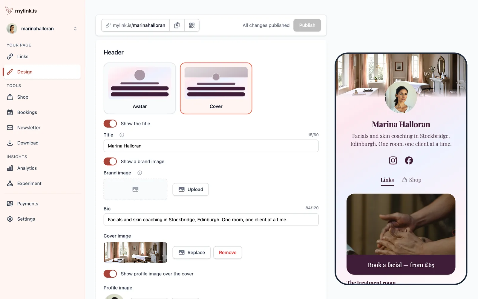
Pick by what the page is for. Somebody who arrives already knowing who you are wants the compact avatar and the links immediately; a page that has to introduce you can afford the cover image at the top.
Your bio lives here rather than in Settings, and deliberately: it is a line that shows on the page, so it belongs beside the thing that shows it.
Pick a theme
A theme is a whole look in one tap — background, button shape, type and the colours that go with them. The tabs across the top are kinds of background, and the choice between them matters more than the individual preset.
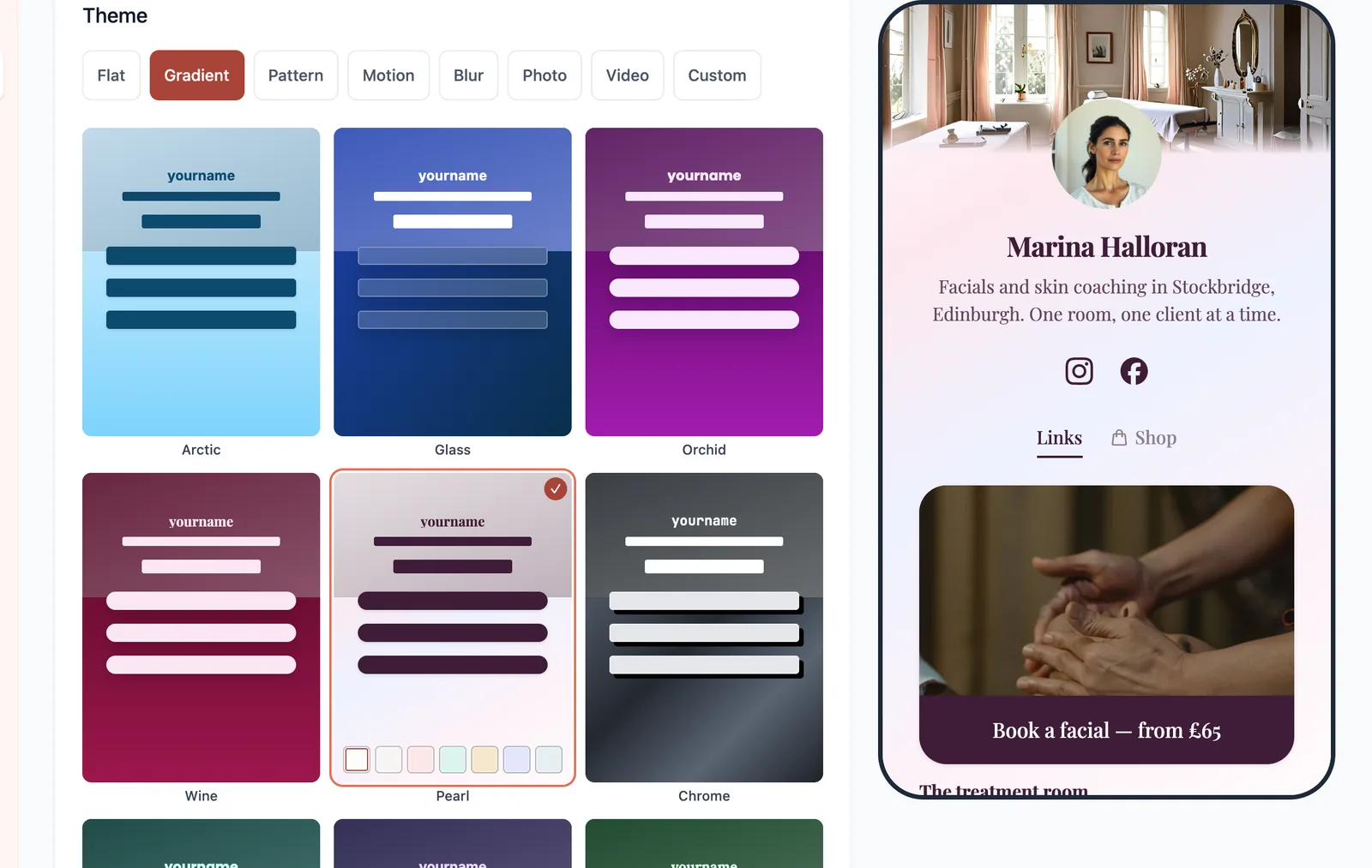
Start plainer than you think you want to. A flat or gently graded background makes every link on top of it easy to read, and that is the page's whole job.
Under the presets there is a line reading Not sure where to start? — Start from a design made for your line of work. It opens the same gallery you were offered on your first sign-in: real pages, one per trade, each with its theme, its cover photograph and its buttons already chosen. It adds to your page rather than replacing it — your bio, your socials and the links already there come through, and the design is laid over the top.
Make it yours
Custom opens the controls behind the presets: your own colours for the background, the buttons and the text, plus the button shape and the typefaces.
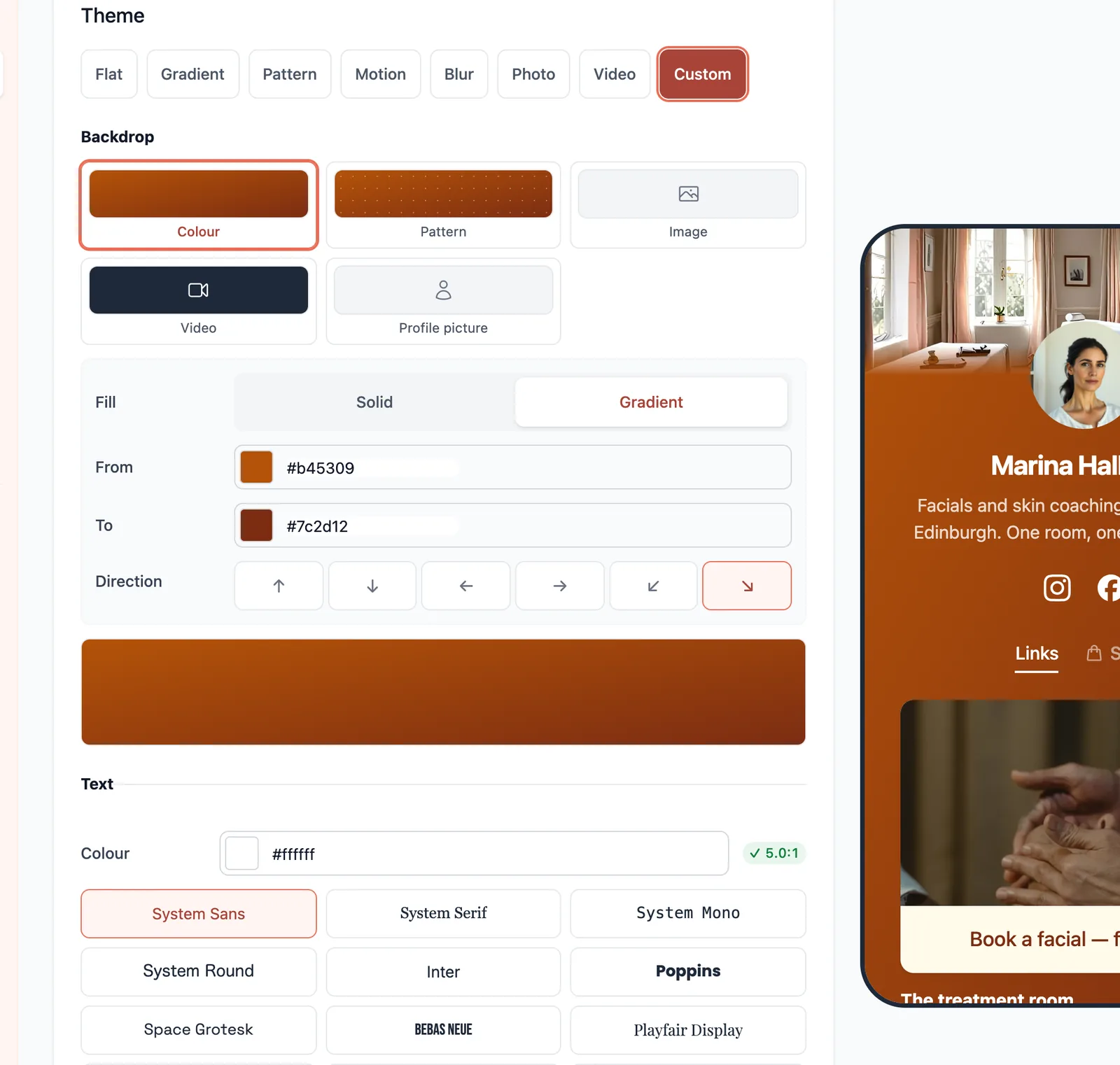
Change the display font alone before you change anything else. Two typefaces is a design and four is a ransom note, and on a page this short the display face is doing most of the work anyway.
Have a backdrop made for you
If you pick Image as your backdrop and have nothing to upload, Generate with AI will make one from a sentence.
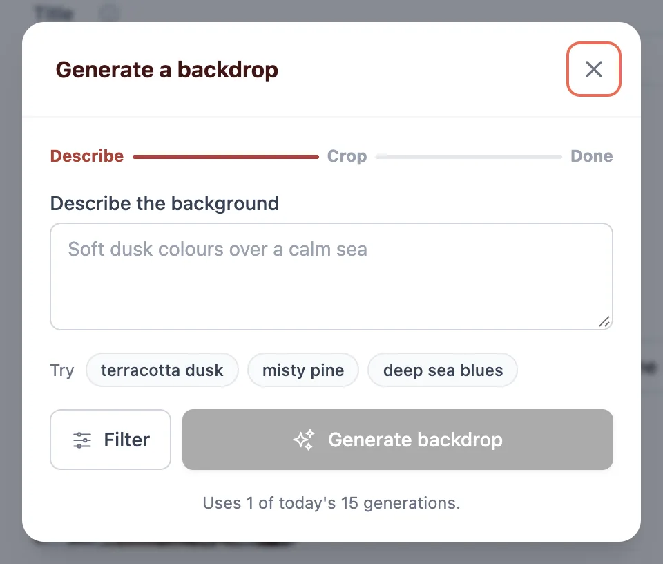
You crop what comes back before it lands, so the part you keep is the part that works behind your own header rather than whatever the middle of the picture happened to be.
There is a cap on how many you can make in a day, and the button tells you where you are against it.
Generated or uploaded, a backdrop is a background — which is the subject of the next section, and the one rule worth reading before you commit to a photograph.
Keep it readable
The editor measures your text colour against the background it actually lands on and warns you when the combination is one a good proportion of visitors would struggle with — including you, outdoors, on a phone at half brightness.
It is a warning rather than a lock, and it is worth a second look before you override it. A page nobody can read converts at nothing at all.
The same rule is why a photographic background looks softer here than the file you uploaded: the page draws a veil over it so the text on top stays legible. That veil is the guarantee rather than a style choice. If the photograph matters more than the words, put it in the header as a cover at full strength and leave the links on a plain background below it.
Check it at phone size
The preview beside the editor is a real handset width rather than a scaled thumbnail, so what you are looking at is the size somebody actually holds. Judge the page there, not on the desktop screen you are designing on.
Two things only show up at that size: a display face that looked characterful at heading size and turns to mud at fourteen pixels, and a headline that fitted on one line and now takes three. Both are cheap to fix before you publish and expensive to notice afterwards.
Design edits a working copy, so nothing you have done here is live until you press Publish.
Ready to try it?
Your page is free to build, publish and share. The paid corners of this guide are marked where they come up.